Tell us something about yourself
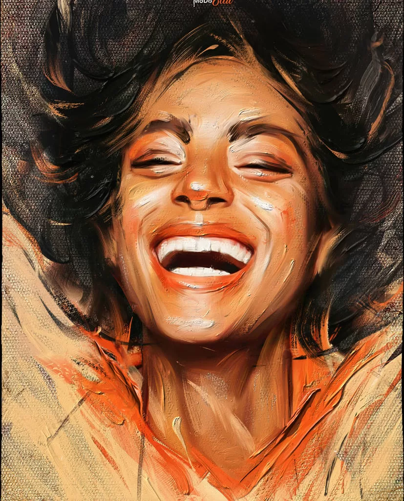
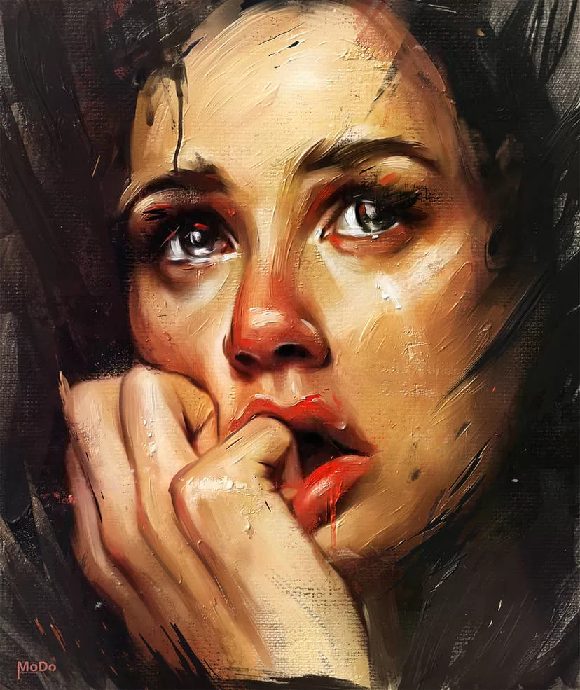
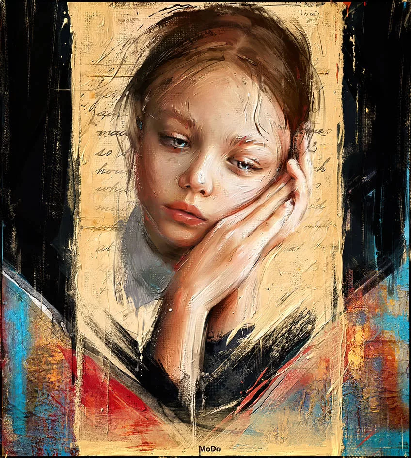
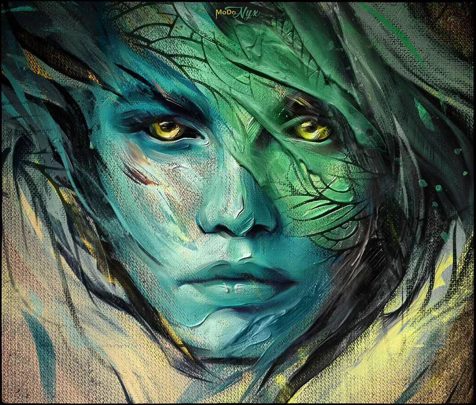
I’m Dmitry Marin, aka MoDo Digital Art, a digital artist from Russia. I love creating vibrant, oil-painting-style art with Corel Painter, full of texture and emotion.
1. Can you tell us a bit about your journey as a digital artist? How did you get started with Corel Painter?
My journey as a digital artist has been a wild ride, full of experimentation and learning. I’ve always loved the look and feel of traditional oil painting – those rich textures, bold strokes, and vibrant colors. But I didn’t pick up a physical brush right away; instead, I stumbled into digital art because it gave me the freedom to explore without the mess of paint tubes! I started messing around with various software, but Corel Painter caught my eye years ago when I saw how it could mimic real oil paints so convincingly. I got hooked on trying to make digital work look like it was painted on a canvas. It was a mix of curiosity and stubbornness to master those tools that got me started, and I’ve been playing with Painter ever since, always finding new ways to push it.
2. Do you have any formal art training, or are you self-taught?
I’d say I’m a mix of both, leaning heavily on self-taught vibes, but I did get a solid foundation from some formal training. Back in Russia, I studied at the Samara College of Service, where I majored as an Advertising Specialist. Among other things, the curriculum included subjects like Painting, Drawing, Composition, Color Theory, Art History, and Computer Graphics. Those classes gave me the basics of academic drawing and really sparked my love for art. I’m super grateful to my teachers there, they had this genuine passion for passing on their knowledge, and that meant a lot. It’s worth its weight in gold, honestly. Beyond that, though, I’ve learned a ton on my own, diving into tutorials, watching other artists, and just experimenting like crazy. There’s always more to learn, and I’m nowhere near done figuring it all out.
3. What drew you to Corel Painter specifically, compared to other digital art software?
Corel Painter stood out to me because it’s like a love letter to traditional painting. Other software is great for clean lines or graphic design, but Painter? It’s all about that painterly vibe, thick, juicy brushstrokes, blending that feels like mixing real paint, and textures that make your work pop. I tried other programs, but none gave me that same “I’m actually painting” feeling. Painter’s brushes behave like they’ve got a mind of their own, in a good way, and that organic quality lets me get lost in the process. It’s not perfect, but it’s the closest I’ve found to bringing oil painting into the digital world.
4. How would you describe your artistic style, and how does Corel Painter help you achieve it?
I’d say my style is a mix of expressive and realistic, leaning heavily on loose painting techniques. I love bold, dynamic strokes that feel alive, with textures that make you want to touch the canvas. It’s about capturing emotion and energy over nitpicky details, like a portrait that’s more about the vibe than every single hair. Corel Painter is my wingman here because it lets me mimic those thick oil paint layers (hello, impasto!) and blend colors in a way that feels natural. The texture controls and brush variety give me the tools to make every stroke count, whether I’m softening edges or piling on chunky paint effects.
Also Read: Exclusive Interview with digital artist – Ingo Lindmeier
5. What are your favorite brushes or tools in Corel Painter, and why?
Oh, picking favorites is tough, but I’ll give it a go! From my custom MoDo sets, I’m obsessed with the Soft Impasto Brush in the Impasto category. It’s got this perfect balance of soft edges and depth that makes thick paint strokes look so natural. The Paint Texture Impasto Brush is another gem because it lets me play with canvas textures and colors at the same time, often surprising me with cool results. In the Edit and Paint category, the Mix Brush is my go-to for blending and simplifying details early on, it’s like a magic eraser for photo noise. I also love the Wet Detail Brush for layer masks; it’s super precise for hiding or revealing effects. These tools just vibe with how I work – intuitive and versatile.
6. Do you create custom brushes or use the default ones? If custom, what’s your process for creating them?
I’m all about custom brushes. I’ve built my own MoDo brush categories because I wanted tools tailored to my workflow. The default brushes in Painter are solid, but I found myself tweaking them so much that I just started from scratch. My process is pretty organic: I’ll start with a base brush, mess with settings like Spacing, Size, Angle, or Dab Type to get the stroke I want. For impasto brushes, I focus on depth and how the brush interacts with paper textures. I also experiment with Captured Dabs to create unique stroke shapes, like in my Brushstrokes set. It’s a lot of trial and error, sometimes I’ll spend hours adjusting one parameter just to see what happens. The goal is to make brushes that feel like an extension of my hand.
7. How do you utilize Corel Painter’s blending and texture features in your artwork?
Blending and textures are the heart of my work. For blending, I use brushes like Mix Bristle or Soft Blend to smooth transitions between colors, especially when I’m turning a photo into a painting. I’ll adjust the Resat parameter to add paint or lower Bleed for crisper edges. It’s like mixing real oils but with an undo button! Textures, though, are where Painter shines for me. I lean on the Paper Library to add canvas grain or dust effects, tweaking Contrast and Scale to make strokes feel alive. For impasto, I combine texture settings with brushes like General Impasto to create that thick, layered look. It’s all about layering those effects subtly so the painting feels like it’s got history, not just a flat digital surface.
8. Do you combine Corel Painter with other software or stick to it exclusively?
I’m not exclusive with Painter, I like to mix things up. Most of my work happens in Corel Painter because it’s my main tool for that painterly magic, but I’ll sometimes jump into Photoshop for certain edits, like when I’m using PNG impasto textures. Those textures are easier to manipulate in Photoshop with layer blending modes like Hard Light. I might also use other software for quick color tweaks or prepping files, but Painter is where the core creative stuff happens. It’s like my home base, and other tools are just pit stops.
9. Can you walk us through your typical workflow when starting a new piece in Corel Painter?
Sure thing! I usually start by grabbing a photo, something with good composition, often royalty-free from the web. I create a new document, say 50×40 cm at 150 dpi, and drag the photo in, scaling it to fit. Next, I duplicate the layer as a safety net, then use brushes like Blur Diffuser or Mix Brush to soften photographic details, think skin pores or pixel noise. From there, I focus on big shapes, sketching out proportions with loose strokes to nail the composition, especially for portraits.
Once I’ve got the foundation, I dive into expressive strokes with Soft Blend or Mix Bristle, adding color and energy. I’ll pull colors right from the image with Alt clicks to keep things cohesive. Then comes the fun part: impasto. I create a canvas texture in the Paper Library (after a slight blur for smoothness), grab the General Impasto or Soft Impasto Brush, and layer on thick paint effects. I use multiple layers with Surface Texture filters – some inverted, some not – to build depth, masking areas to control where it shows.
Finally, I add details like dust or scratches with Texture Paint Brush, tweak colors with Correct Colors, and maybe throw in a subtle white border for polish. It’s a mix of planning and going with the flow, always keeping room to experiment.
10. How do you approach color selection and mixing in Corel Painter?
I’m a bit of a rebel with colors, I rarely use the color palette. Instead, I grab colors straight from the image by holding Alt and clicking. It keeps my palette tied to what’s already there, so the painting feels unified. For mixing, I love Painter’s Mixer Pad for multicolor brushes like Bristle MC5. I’ll sample a range of colors from the image and let the brush blend them naturally, creating those lush, organic transitions. If I need a pop, I’ll push contrast or add reflected light to make things glow. Honestly, it’s less about rules and more about what feels right in the moment. I’m always tweaking until the colors sing.
11. Do you sketch traditionally first or go directly into digital sketching?
I go straight to digital sketching in Painter. Traditional sketching is cool, but I love the flexibility of digital, undo is my best friend! I’ll start with a photo as my base and use brushes like Mix Brush to rough out shapes right on the canvas. It’s less about a perfect sketch and more about feeling the flow of the composition. Digital lets me jump between sketching, blending, and painting without switching tools, so it keeps my creative momentum going.
12. How do you manage layers in your artwork? Do you have any specific techniques or tips?
Layers are my safety net and playground. I always duplicate my base layer before major changes, so I can backtrack if I mess up. For impasto, I’ll use multiple layers, one for main depth, another for inverted depth, and more for fine details, each with masks to control where effects show. My tip? Use Wet Detail Brush on masks with black to hide or white to reveal. It’s super precise. I also merge layers when I’m happy with a stage to keep things tidy, but I keep copies just in case. Don’t be afraid to stack layers for textures; it’s like building a painting brick by brick.
13. Where do you find inspiration for your artwork?
Inspiration hits me from everywhere – nature, old oil paintings, random photos, even the way light falls on a wall. I’m a big fan of studying classic artists to see how they handled texture or mood, but I also get sparks from everyday stuff, like a cool color combo in a sunset or the vibe of a portrait I stumble across online. Honestly, it’s less about hunting for ideas and more about staying open to whatever catches my eye. The more I create, the more I notice things that scream, “Paint me!”
14. Have you faced any challenges while using Corel Painter? How did you overcome them?
Oh yeah, Painter’s thrown me some curveballs. Early on, I struggled with lag on slower computers, those heavy impasto brushes can be demanding. I learned to tweak Spacing to lighten the load, even if it meant slightly less smooth strokes. Another challenge was getting textures to look natural without overpowering the painting. It took a lot of experimenting with Paper Library settings and layer masks to find that balance. Sometimes the software’s quirks, like finicky brush settings, drove me nuts, but I’d dig into forums, watch tutorials, or just mess around until I cracked it. Patience and persistence are key.
15. Do you have any favorite Corel Painter features that significantly enhance your creative process?
The Paper Library is a game-changer, being able to customize canvas textures and apply them to brushes makes my work feel so tactile. Impasto controls are another favorite; they let me pile on paint like I’m sculpting. I also love the Mixer Pad for multicolor blending. It’s like having a real palette but without the cleanup. And layer masks? Total lifesaver for non-destructive edits. These features give me the freedom to experiment without fear of ruining everything, which is huge for my creative flow.
16. Do you sell your artwork or take commissions? If so, how does Corel Painter help you create work suitable for clients?
I do sell my artwork and occasionally take commissions, though I’m picky about projects to keep things fun. Painter helps me deliver for clients because it’s so versatile. I can nail that traditional oil painting look they often want, with all the depth and texture. The ability to tweak colors, textures, or details on the fly means I can meet specific requests without starting over. Plus, Painter’s high-res output ensures everything looks crisp for prints or digital use, which clients love.
17. Have you ever used Corel Painter for professional projects, such as illustrations, concept art, or book covers?
Yeah, I’ve used Painter for a few professional gigs, mostly illustrations and portrait-style pieces. I haven’t done much concept art or book covers yet, but the portrait work often ends up in prints or personal collections. Painter’s strength here is its ability to mimic traditional media, which clients in those fields often ask for. The realistic brush behavior and texture options let me create polished, professional-grade work that feels handcrafted, even if it’s fully digital.
18. How do you handle file formats and resolution to ensure print-quality results?
I usually work at 150 dpi for most projects, sometimes bumping it to 300 dpi if I know it’s headed for high-quality prints. My go-to canvas size is around 50×40 cm, but I’ll adjust based on the project. I save progress in TIFF to preserve layers and quality, especially when using composite methods. For final output, I export to JPEG or PNG, depending on whether it’s for print or web. Before exporting, I’ll double-check resolution and sharpen slightly with filters like Smart Blur to ensure crisp details. Merging layers carefully is key to avoiding surprises in the final file.
19. What features would you like to see added or improved in Corel Painter?
I’d love a smoother performance for heavy brushes, less lag on complex impasto effects would be a dream. A more intuitive way to organize custom brushes and paper libraries would save me some headaches too. Maybe a built-in texture importer for PNGs that auto-aligns with lighting, so I don’t have to jump to Photoshop as often. Oh, and better hotkey customization for workflows like mine it’s good now, but could be slicker. Painter’s already awesome, but there’s always room to polish it up.
20. What advice would you give to aspiring digital artists who are starting with Corel Painter?
First off, don’t be intimidated. Painter’s deep, but so rewarding. Start simple: play with a few brushes, like the Oils or Blenders, and get a feel for how they move. Experiment like crazy – tweak settings, try weird textures, make mistakes. Watch tutorials, but don’t just copy; use them to spark your own ideas. Focus on big shapes before details to nail composition early. And don’t chase perfection, let your strokes be bold and messy sometimes; that’s where the magic happens. Keep practicing, trust your gut, and have fun. You’ll find your groove with time.


Pingback: Exclusive Interview with Britta Jacobs - Photoshop Inspire